Neha HiremathProduct designer, 2026
Designed and builtby me, in code
Winner · SF Design Week Innovation Awards 2026

Resume

Studio

ClickTap any to watch full screen

I can make things move too.

About

Neha Hiremath
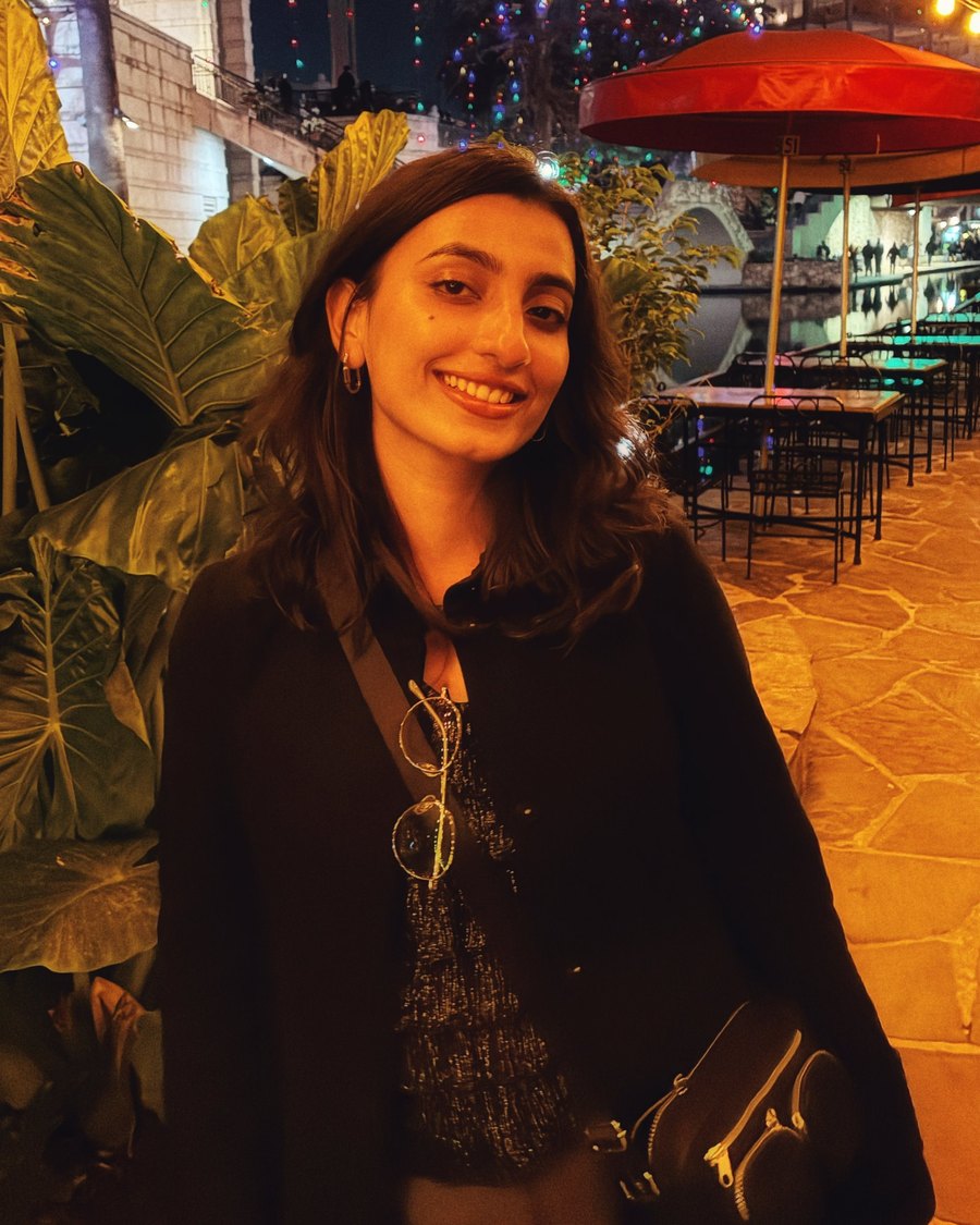
Neha Hiremath on the San Antonio River Walk at night

Designer, storyteller

I started in fashion design in India, moved through visual communication and UX research, and landed in product. Different tools, same habit: understand people first, then build what actually helps them. Today I take projects from research to shipped product, and I prototype in code before ideas turn into decisions.

  1. Fashion
  2. Visual communication
  3. Product & interaction
  4. Building in code
Off screen
  • Cooking from an Asian kitchen
  • Photographing the walk home
  • Myths about gods and stars
  • Learning Japanese

Where I've worked

StandUp For Kids CurrentlyUX Designer

MAGIC Spell StudiosLead Product Designer

Rochester Institute of TechnologyProduct & Multimedia Designer

Rochester Institute of TechnologyUX Researcher

Minutus ComputingProduct Designer

Landmark GroupDesign Intern

Studied

MFA, Visual Communication DesignRochester Institute of Technology

Bachelor of DesignNational Institute of Fashion Technology

Recognition

Winner, SF Design Week Innovation Awards2026

Honorable Mention, Graphis New Talent Awards2026

Bring me the messy one. I'll bring it back working.

Growing Resilience

Designing a healthcare tool for 200,000+ rural families.

Clinical research turned into a garden families build, for the University of Rochester Medical Center.

Try it in 3D ↓

This project is under an NDA. Some details and artifacts can't be shared publicly. I'm happy to walk you through the full process on a call.

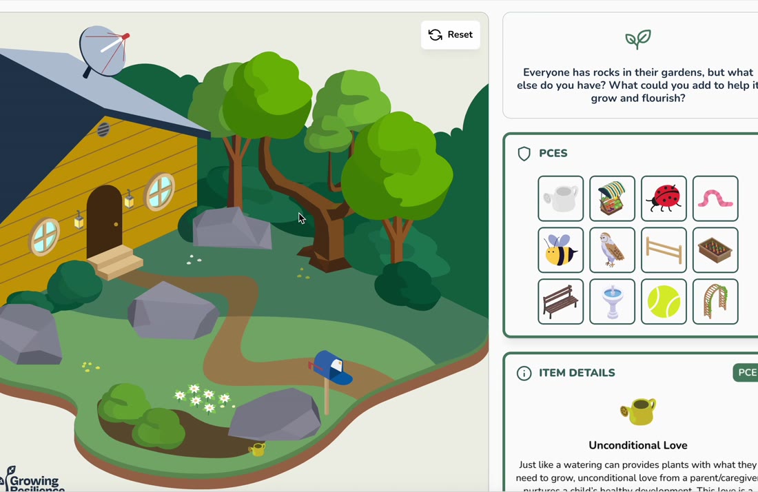
The shipped prototype. Families add positive experiences to a garden that already has rocks in it.

The research was solid. The format kept families out.

Research on Adverse and Positive Childhood Experiences usually reaches people as reports, clinical frameworks and long educational material written for healthcare professionals. For families, especially in rural communities, that creates two barriers.

Information overload. Long, text heavy explanations are hard to engage with in day to day life. Low retention. Passive reading rarely turns into real behavior change.

And the audience had hard limits. Attention on a single screen has dropped below a minute, and parts of rural New York still have little or no broadband.

<1 minaverage attention on a single screen, down from 2.5 minutes in 2004UC Irvine
1M+New York households without a broadband subscriptionNY State Comptroller
~25%of people in some rural counties with no broadband accessNY State Comptroller

The challenge wasn't simplifying the content. It was making it feel natural and low effort, while keeping a medical institution's credibility.

From a list of recommendations to a garden you build.

Rather than presenting resilience as a list of recommendations, I led the team in reframing the experience around participatory learning. Families don't read about what helps a child. They build it.

The garden metaphor had three jobs: make abstract concepts tangible, invite exploration instead of passive reading, and create emotional engagement through visual storytelling. Growth is already how people talk about raising a child, so it carried those jobs without explanation.

Reading about resilience became building it.

Every garden already has rocks.

The research covers hard experiences too. Leaving them out would have been gentler, and less honest to families who live with them.

So the garden starts with rocks. Each rock is an adverse experience, like household dysfunction or neglect, and tapping it explains what it means. The tool opens with one question: "Everyone has rocks in their gardens, but what else do you have?" Families build around the rocks instead of being judged by them.

Tapping a rock explains the hard experience it stands for, without blame.

It started on paper.

Before any screens, I sketched the core structure for web and mobile: the garden at the center, an inventory of positive experiences beside or below it, and a clear path to the assessment and resource library.

Even the first hover state had a read aloud button on each rock. Not every family wants to read, so listening was designed in from the start.

First sketches: web layout, welcome page, mobile structure and the rock hover state. Tap to enlarge.

Try it for yourself.

The whole experience runs on one loop a family learns in seconds: pick an item, place it in the garden, and read what it stands for. Each placement turns an abstract idea into something you can see.

Below is a 3D version of the garden so you can see how it feels. Add items, tap the rocks, and drag to turn it.

  1. 1Plant something. Tap any item in the PCEs panel.
  2. 2Learn what it means. Tap a rock or a planted item.
  3. 3Look around. Drag the garden to turn it.
Tap an item to plant it · Drag to turn
Everyone has rocks in their gardens, but what else do you have? What could you add to help it grow?

PCEs

Item details

Tap an item or a rock to learn what it stands for.

A 3D take on the shipped garden, designed and coded by me in Three.js.

Where the inventory lives decided whether people used it.

We tested different inventory bar placements to see which matched user expectations and felt comfortable to use: a vertical rail beside the garden, a grid underneath it, and a panel to the left, across desktop and mobile.

The final design puts the inventory in a panel beside the garden, with item details directly below it. The choice and its explanation sit together, so nobody has to hunt for what just happened.

Round one: inventory placements across desktop and mobile. Tap to enlarge.

Rural families needed context before they'd play.

Further explorations showed that more context around the topic and the inventory objects would better support rural users unfamiliar with the subject. A garden with no explanation felt like a game with no rules.

So the shipped version opens with a short welcome and three plain steps, Interact, Learn and Grow, before the garden. The flat lawn also became a richer scene with a home, so it reads as a family's own space.

Round two: more context up front, and a garden that feels like home.

Warm enough for families. Credible enough for a medical center.

URMC's brand is built on clinical blues and white. Blue reads sterile, the opposite of a warm evening in someone's backyard. I anchored the tool in greens and warm neutrals, colors that read as garden and growth, and kept the brand as a trust marker in the header and footer.

The new palette wasn't a break from the brand. It keeps a deep navy close to URMC's dark blue, softens its bright yellow into mustard, and adds two greens and a linen ground for the garden.

URMC brand

Dark blue#003B71
Light blue#0061AB
Yellow#FFDD00
Elevate#147BCB
Horizon#E6F3FE

Growing Resilience

Navy#213951
Teal#3A6665
Green#497D66
Mustard#CB9A00
Mist#B4C2D6
Linen#EEEFE6

From the brand guide to the garden.

Recovery Center of Excellence
Unconditional love Just like a watering can gives plants what they need to grow, a caregiver's unconditional love helps a child thrive. Keep growing

The same card in each palette, using the real hex values.

The trade-offs, and why I made them.

Illustrated, not photoreal or symbolic

Photoreal felt too heavy for mobile load times and risked looking dated fast. Fully symbolic, more icon than garden, felt cold and lost the warmth that was the whole point. Illustrated but warm read instantly as a garden to someone with low context, and stayed light on a spotty connection.

Rocks stay in the garden

Removing hard experiences would have been gentler and less honest. Keeping them, and asking what else you can add, kept the tool truthful without shaming anyone.

A glossary, not longer cards

Item details stay short enough for a one minute session. A structured glossary holds the depth for anyone who wants it, without interrupting the main experience.

Plain language, negotiated line by line

Clinical language needed simplifying, but oversimplifying risked losing credibility. Microcopy went through several rounds of tightening with the client, a real negotiation between accessible and medically credible.

Mobile first by default

Layouts, spacing and touch targets were sized for small screens first, for families who mostly rely on their phones.

Leading the work, not just the screens.

I guided the exploration of the garden metaphor with the team, working through multiple visual directions together: lush and playful, minimal and symbolic, and everything in between. I led the sketching of layout options and directed the design system strategy.

I worked closely with a graphic designer who brought the illustrations to life from my direction on style, tone and visual consistency. We were a team of four. I reviewed the work with our PM and URMC stakeholders, and the job was holding two goals at once: approachable for families, credible for a medical institution.

What shipped.

The shipped experience covers 12 positive childhood experience categories, each translated from dense clinical research into interactive, family friendly content. The prototype was handed off to URMC and published on the Recovery Center of Excellence platform. The client said the interaction design exceeded their expectations.

It was the first time URMC's childhood resilience research reached everyday families as something interactive, moving public health education out of clinical reports and into people's hands.

The shipped home and the glossary of all twelve experiences. Tap to enlarge.

12positive experiences made interactive
1stinteractive tool from this research for families
3 mofrom brief to handoff
$3.33Mfederal program it was built for

Room to bloom.

My biggest reflection is cohesion. The garden achieved what we set out to: warm, engaging and approachable. But the website around it stayed bound by institutional conventions, and the tonal shift between the two is jarring. With full creative freedom, I'd extend the garden's warmth, illustration style and palette across the whole experience, so families never feel they've stepped back into a clinic.

Good health education shouldn't feel like a government form.

The platform was handed off after our engagement, and I don't have post launch usage data. Running it again, I'd push for structured usability testing with real caregivers before handoff, to sit alongside the strong stakeholder feedback we received.

Keep exploring
Back to all work
URMC Recovery Center of Excellence Redesign

Turning 200+ pages into one accessible system for a $3.33M federal health program.

A mobile first redesign of the URMC Recovery Center of Excellence site, live for rural communities across New York.

This project is under an NDA. Some details and artifacts can't be shared publicly. I'm happy to walk you through the full process on a call.

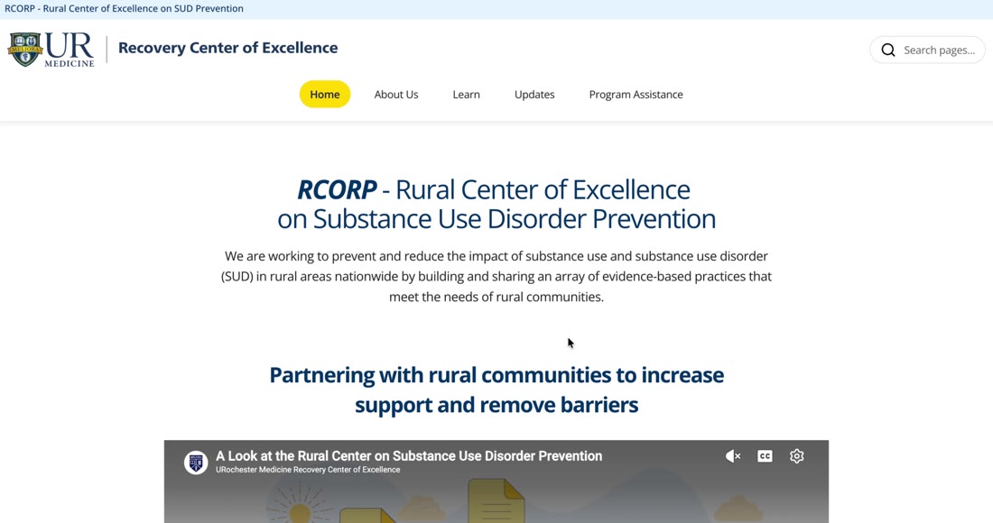
The live site

This is the live site. Scroll it like a family would.

The phone is running recoverycenterofexcellence.org. Scroll and tap inside it to see the patterns in use.

  • The mission, firstOne readable headline. No flyer to scroll past.
  • Two clear doorsResources to learn, Program Assistance to get help.
  • Impossible to missPartners and the survey get their own color blocks.
  • Updates that scanSame card structure every time.
  • Built to keep growingNew programs drop into existing patterns.
Go to the live site
Responsive

Designed for the phone. Built for every screen.

The same patterns hold at every width. This laptop runs the live site too.

Over 200 pages, no system, and an audience on their phones.

The Recovery Center of Excellence is the same $3.33M federally funded program behind Growing Resilience. Its website is where rural communities across New York find prevention and recovery resources for substance use disorder.

The site had grown to 200+ pages of fragmented content with no consistent design system. The people it serves, rural individuals, families and caregivers, are often on a phone, short on time, and unfamiliar with dense healthcare content.

I audited the site before touching a single screen.

The clearest finding: on mobile, people had to scroll through three or more screens of unstructured text before reaching core resources. And the same patterns repeated across the whole site, so fixing one page wouldn't fix anything.

Small text, thin lines and almost no paragraph structure made everything look equally important. Featured content had no emphasis, and contact information sat buried in the footer.

The site before: overview, about and updates. Tap to enlarge.

Five problems that repeated on every page

  1. Unclear content hierarchyHeadings, body and links all carried the same weight.
  2. Low discoverabilityKey resources lacked visibility and sat deep in long pages.
  3. Inconsistent layoutsCards and sections changed structure from page to page.
  4. Limited visual emphasisFeatured content looked exactly like everything else.
  5. Slow mobile scanningLong scrolls with no anchors to stop on.

Designed for the phone first, then scaled up.

Most of this audience reaches the site on a phone, so I designed every pattern at phone width first. If a page worked one thumb at a time on a small screen, it would work everywhere. Desktop and tablet were the adaptation, not the starting point.

That meant short sections with clear headings, one primary action per screen, tap targets sized for thumbs, and nothing important hidden below a wall of text.

Every direction had to pass four tests.

I explored multiple directions with stakeholders. Each one was judged on the same four questions, so the decision was about the people using the site, not personal taste.

Does it simplify?Less to read before you find what you came for.
Can you scan it?Clear anchors on a small screen.
Is it trustworthy?Credible for a medical institution.
Is it approachable?Comfortable for people outside healthcare.

The chosen direction balanced approachability, clarity and credibility.

Six patterns instead of 200 one-off pages.

Rather than redesign pages one by one, I built a set of flexible content patterns that every page draws from. Each one answers a problem from the audit.

  • 01Simplified navigationFive clear destinations and search, in one tap.
  • 02Improved hierarchyBold, readable headings and short intros up top.
  • 03Stronger calls to action"How can we help?" with one obvious next step.
  • 04Discoverable contentImage led cards with clear titles and "Read more".
  • 05Clear categoriesFilter by Prevention, Stigma or Treatment, with summaries on demand.
  • 06Action oriented sectionsLearn and Connect cards that tell you what to do next.

Leading the work, end to end.

I led the design from audit to final screens in Figma, owning the information architecture, UX, UI and design system. A co-designer implemented the front end in Framer from my designs.

The work went through multiple review cycles with URMC stakeholders, refining structure, consistency and usability each round.

What shipped.

The platform was restructured from 200+ fragmented pages into one scalable, accessible system, and it's live on desktop, tablet and mobile. The content patterns make the site easier for the team to manage and ready to grow as the program does.

200+pages brought into one system
6reusable content patterns
WCAGcontrast checked brand palette
$3.33Mfederal program it serves

Designing inside a system that isn't yours.

Institutional requirements shaped this project more than anything I drew. The biggest lesson was the value of designing well within someone else's system: knowing which rules protect the user and which ones are just habit.

Given more freedom, I'd push toward a warmer, more editorial direction that still follows URMC's brand, putting human connection ahead of clinical neutrality. And I'd want real numbers: time to find a resource, and how many visitors reach Program Assistance, before and after.

It's live. Go see it.

The redesigned platform is serving rural communities right now, on every screen size.

recoverycenterofexcellence.org
Visit the live site ↗

Keep exploring

Back to all work
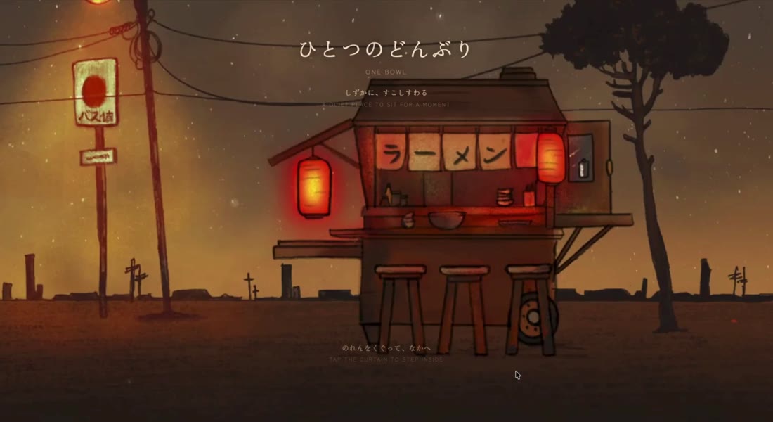
One Bowl 一杯

Hand painted, then vibe coded into a living web experience.

I illustrated every piece in Procreate and built the whole thing with AI, from first prompt to live on Vercel.

The full experience, start to finish.

A pause button, shaped like a ramen stall.

One Bowl is a quiet place to sit for a moment. No score, no timer, nothing to win. You build a bowl of ramen one ingredient at a time, in Japanese and English side by side.

I used it to test a question I care about as a designer: how far can one person take an idea, from sketch to shipped, with AI as a collaborator?

From pencil to production.

The art is entirely hand made. The build is entirely AI assisted. I directed both.

  1. 01ProcreatePainted the stall, the street, the bowl and all 10 ingredients on iPad, then exported each layer separately.
  2. 02Claude and CursorVibe coded the build: drag and drop, layered ingredients, the curtain transition, ambient music and the ending.
  3. 03VercelDeployed and hosted live, so anyone can open it on any screen.

Painting the stall and the finished bowl in Procreate. Tap to enlarge.

Four moments, one quiet flow.

01
Step through the curtain

A lantern lit stall on an empty street. Tap the noren curtain to go inside.

02
An empty bowl

The bowl sits center stage. Ingredients wait in order on the right, and the first one, broth, lights up.

03
Build it, one at a time

Drag each ingredient into the bowl. It settles in, gets a check mark, and the next one lights up. The dots up top track progress.

04
It ends with a question

When the chopsticks go in, the scene dims and asks "What does this remind you of?" Type a memory, leave it, or just be still.

AI writes the code. Taste still decides.

The tools made building fast. The hard part was the same as always: deciding what it should feel like, and saying no to everything that broke the calm.

Interact. Slow down.

Make yourself one bowl.

Try it live one-bowl-chi.vercel.app

Keep exploring

Back to all work
Cosmic Legends

One star, three skies. A kiosk that turns astronomy into storytelling.

My award winning thesis. A large touchscreen experience where the same star, Betelgeuse, becomes a protector, an old man or an investigator, depending on whose sky you stand under.

See the journey
The full kiosk experience, 3:40. Tap for sound.

Star apps tell you what a star is. Not what it means.

Tools like Stellarium and Night Sky present the sky as data, mostly through a Western lens. Coordinates, brightness, distance. The stories people have told about the same stars for thousands of years rarely make it onto the screen.

What the apps say

Betelgeuse. Red supergiant. Right shoulder of Orion.

What people have seen

A sacred protector. An old man. A silent investigator.

Same star. Three stories.

I followed Betelgeuse, the red star in Orion, through Navajo, Tupi and Japanese sky culture. The star never moves. The story around it does. Pick a sky.

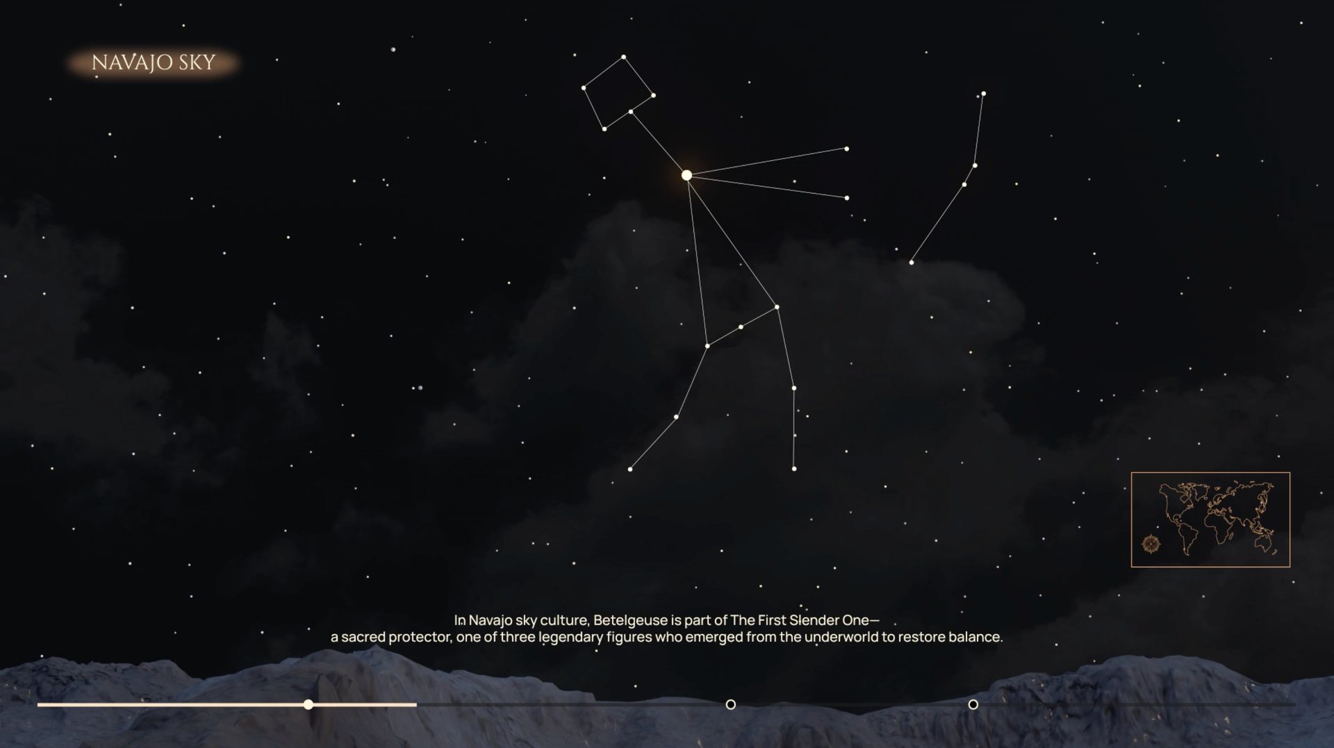
Navajo sky with Betelgeuse as part of the First Slender One
The First Slender One

A sacred protector, one of three legendary figures who emerged from the underworld to restore balance.

Listening before drawing.

I talked with educators, astronomy enthusiasts and students who had never heard Indigenous sky stories. Then I read across ethnocosmology, visual anthropology and accessibility research, and studied the tools people already use.

PrimaryConversations

Educators, astronomy fans and students new to Indigenous sky knowledge.

SecondaryLiterature

Ethnocosmology, visual anthropology and accessibility UX.

CompetitiveStellarium, Night Sky

Strong on science. Almost silent on culture.

The opportunity was clear: keep the science, add the story, and make it work for someone touching the screen for the first time. Narration and captions run together, so visitors who can't read the text or can't hear the voice still get the story.

It started with a scene from Moon Knight.

A god turns back the night sky and the stars streak into rings above the desert. That one shot made me want the sky itself to move every time a visitor travels to a new culture.

The inspiration. Moon Knight, Marvel Studios.
My version. The sky turns from Navajo to Tupi.

Flat first. Then the sky.

The creative phase ran on experiments, not storyboards. A flat prototype tested story order, voiceover and layout. Then I moved into Cinema 4D to build a sky that felt real.

The first map had five cultures. The final kiosk has three, so each story gets room inside a short visit.

01  The 2D prototype

Five cultures around one star. The first map.
A flat, tappable version to test story order and pacing.
Testing voiceover, layout and transitions.

02  Building the sky

Starting with the built in Cinema 4D skies.
They felt flat and generic.
Placing each star by hand in 3D space.
Background planes with stars stacked in layers.
Every culture's sky needed its own placement.
Layered stars. The sky finally felt natural.

03  Making the sky turn

Emitter tests to recreate the turning sky.
Placing emitters around the terrain.
The first star trail render.
Tuning material and glow for Betelgeuse.

Strangers, standing up, with a few minutes.

A public touchscreen is not a phone. People walk up cold, often in groups, and leave whenever they want. Every decision came back to that.

01One clear action

Big targets, almost no controls, and one prompt at a time: "To continue, tap Betelgeuse."

02Story as motion

Oral and symbolic stories became transitions, narration and light, without losing cultural accuracy.

03Built to grow

Each culture is a module. A new sky can be added without redesigning the experience.

The glowing star is the only thing to tap. Everything else waits.

Ten moments, one star.

The whole visit is one path. Each tap moves you forward, and the sky does the rest.

  1. 01Begin

    A quiet, cloudy sky. Tap to begin your journey.

  2. 02Above us, legends live

    The title rises in gold and sets the promise: same stars, different stories.

  3. 03Where you are

    A map places you on Navajo land in North America before the sky opens.

  4. 04Navajo sky

    Betelgeuse lights up as part of the First Slender One.

  5. 05The story card

    Tap the star to open its story, read and narrated.

  6. 06The sky turns

    Star trails carry you south to Brazil.

  7. 07Tupi sky

    The same star now belongs to the Old Man.

  8. 08It turns again

    Onward to Japan.

  9. 09Japanese sky

    Now it is the Investigator, watching the world in silence.

  10. 10The sky settles

    The title returns. The star stays where it always was.

Trial runs before the big night.

Before Imagine RIT, I tested the build on real hardware: the touch table, the large screen, and dark rooms around campus. Every run showed me something to fix, so nothing was a surprise when strangers walked up.

Test runs on the touch table and screens, and mapping the room before the show.

1,000+ visitors looked up.

At Imagine RIT, families, students and first time visitors took turns at the table. Watching real people use it in a crowded, noisy room was the best usability test I could ask for.

Then the awards came.

Winner, 2026SF Design Week Innovation Awards
Honorable Mention, 2026Graphis New Talent Awards

Awards night, San Francisco, 2026.

It also led to my role as Lead Product Designer at MAGIC Spell Studios, where I brought the same storytelling into federal health work.

More skies are waiting.

The modular system leaves room for narration in local languages with regional voices, new skies from African, Oceanic, Indian, Chinese and Inuit traditions, and classroom kits so schools can bring the kiosk in.

Wonder is a design requirement.

The best moments happened when research, accessibility and story were treated as equals. When one led and the others followed, it read like a museum label. When they worked together, people looked up.

Look up.

Same star. Different story.

Keep exploring

Back to all work
Work